
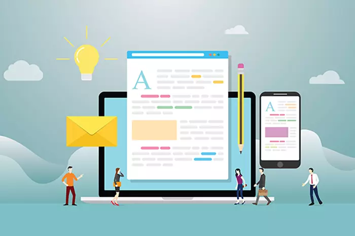
In the last ten years, Internet, from being a luxury has become a necessity around the globe. With mobile as a
primary access route continuing to escalate, it is impossible for any business to survive without a responsive design for its website. This holds true even for the blog sites and especially if the blog incorporates an online store, it becomes an indispensable element. People interact with their smartphones for everything – mobile sites and have been showing a higher level of user engagement with every passing year. This also means that if you don't have a responsive design for your website, you will lose out on a great degree of customers. With mobile usage continuing to increase the only way to get more subscribers and readers is to optimize your blog for multiple devices by creating a mobile site.
If you have activated your blog on a platform such as WordPress, it is easy to use the mobile version to post and build your business online. However, it is common for bloggers who are the creators of surplus content to write on their desktop or laptops. However, when it comes to businesses, the perspective needs to change. In this case you need to focus on the receiving end, i.e. of a mobile phone user.
Here are 4 ways to optimize your blog for mobile:
Make it responsive: a preprogrammed customization for your visitors We cannot reiterate it enough, making a responsive design for your website will allow users to access your website on any kind of device – be it tablet or smartphones of every kind. By making your website responsive, no matter which device is being used, the website will customize to its functionality. For example, to fit a mobile screen, the site and text will shrink down as needed. As mentioned before, if the blog is launched on WordPress then selecting a responsive theme or template from the control panel is quite a simple task. However, if a business has its own web design then building a responsive design can require some extra effort. Either you would need to completely redesign it to make it responsive or implement changes on HTML and CSS that can take a while. During that time, you can even think of having a separate mobile site till the responsive design is completed. With a separate mobile site, you can have different content, images etc.
Build a smooth running mobile site The way the site functions on a smaller screen largely differs from the way it is on the desktop. Hence, making your blog mobile friendly require functional tweaks. For example, keeping a one page website for your smartphone or tablet screens makes it easy for your consumers to just scroll up and down to find the relevant information. Having multiple pages is not a problem, but organization is key here so that it easy to locate and just one click away. Graphics: You cannot have users uploading huge photos on smaller screens – it would take forever. This also means that the file sizes need to be small. Posts: Blogs do have a lot to convey however you need to keep it well organized so people can smoothly skim through it on a small screen. So giving headers or paragraph breaks is important. Text by consumers: Asking your consumers to fill an endless form or survey will immediately shut them off. Even if getting their opinions in written is important, ensure that you require the absolute minimum content from them.
Get a third party site for your graphics Images are an important part of any blogging site. However, graphics require hefty licenses and a proper format for any mobile site. Having a huge file or a wrong format, which will not allow your photos to load will leave a bad taste for your visitors, even the patient ones. The key here is to integrate your site with a third party site such as Instagram. Instagram has a number of widgets available which will allow you to incorporate your images into the blog posts.
Safeguard your mobile site and your users Security is key to running successful sites on any platform – whether you have a website or a mobile site. In case of mobiles you must keep your site protected by keeping it updated, as updates are integrated with security codes. Changing your password on a regular basis is a good safety measure to avoid hacks. When dealing with ads or photos its better to understand the security measures before getting them on board. Focusing on these 4 elements can help you build a great mobile site for your blog. Besides getting the basics out of the way, BluEnt can help you add the 'wow' factor to your mobile site. Connect with us to create the most mobile friendly site for your blog.
Maximum Value. Achieved.

 How Much Does App Development Cost? A Budget Estimation Guide
  Using Angular to Develop Mobile Apps Can Be a Game Changer for Your Business
  Pros and Cons of the WooCommerce Plugin for Online Merchants
  Mean Stack vs LAMP Stack: Which One is Better for Your Business?
